Grey.
The end.
Just kidding!
If only it were that simple! In fact, the best color for your restaurant will probably not be the best color for the restaurant down the road. Different light levels, cuisines, restaurant size, and even service styles should all be considered when choosing colors.
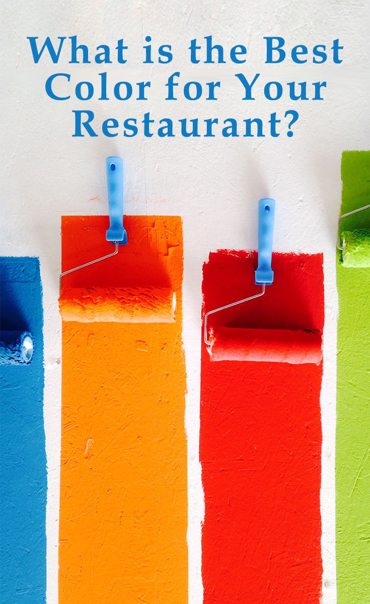
It’s no secret that color has an effect on people. It can influence emotions, blood pressure, and even hunger levels! So choosing your restaurant color can be a big deal! Here is some guidance to help you decide the perfect hue for you.
Red
Red is an energetic, passionate color. It can increase heart rate and blood pressure, and is great for grabbing attention. So should you use it for your restaurant?
When you may want to use it
Red has been said to stimulate appetite, which makes it a strong choice for restaurants. And red tablecloths have been shown to make people eat more.
It can also stimulate impulse eating. So if your restaurant is the type of place that benefits from lots of small food decisions, red may be good for you. Think fast food, small plates, or dim sum.
If you don’t want to cover your walls in red, consider using it as an accent color. Napkins, wall art, or even the back bar could be good candidates for red.
When to avoid it
That increase in heart rate may encourage people to eat more, but it also encourages them to keep moving. A high-turnover restaurant could benefit from bright red, but if you want your guests to linger, keep looking.
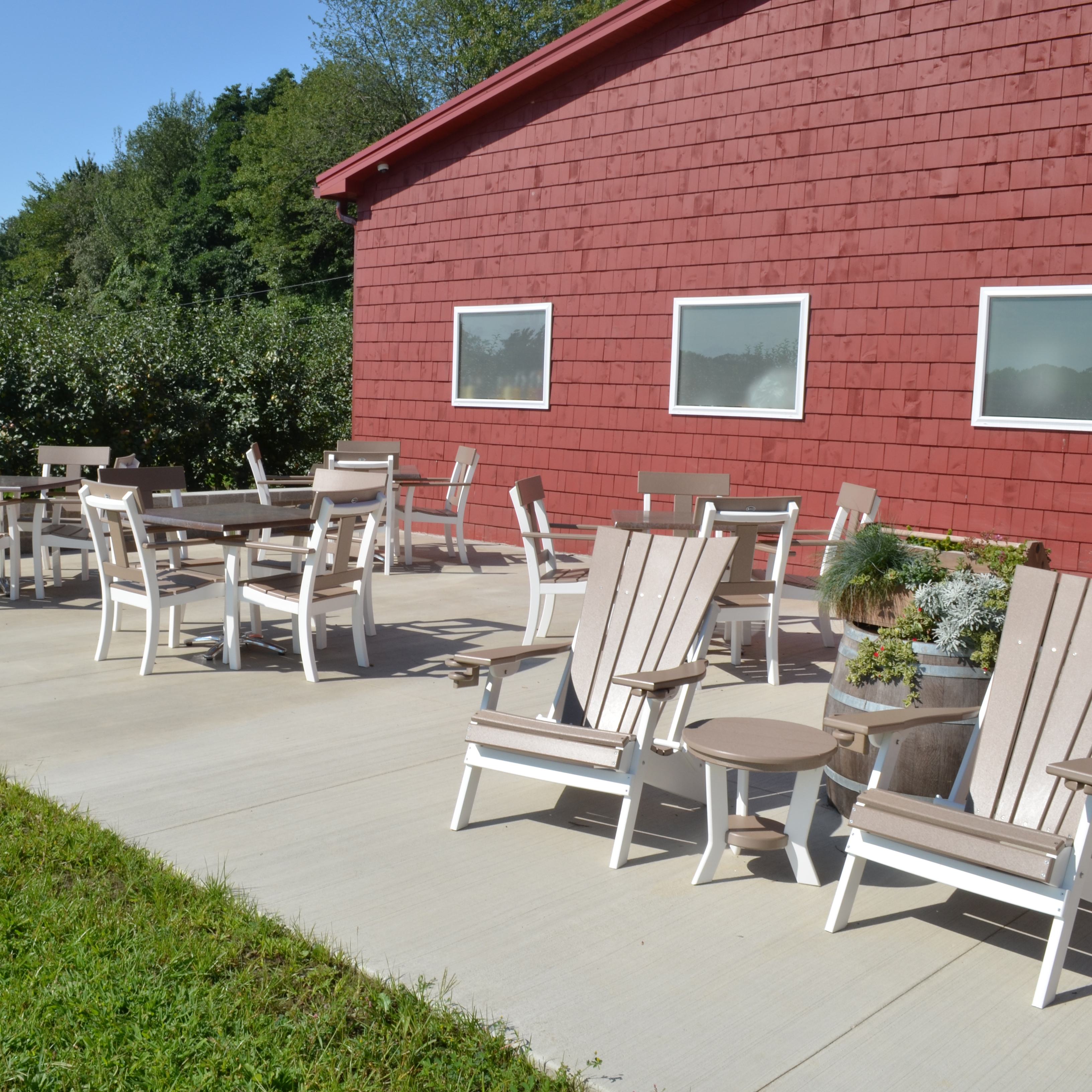
An exception is deep, dark reds like garnet or wine. The darker hue is cozier and warmer, and encourages diners to hunker down in their booths for the evening.
Blue
Blue is a conservative color, connoting stability and safety. There’s a reason why so many corporate logos feature blue.
It’s the most popular color in the world, but that doesn’t necessarily mean it’s the best choice for your restaurant.
When you may want to use it
A lovely clear blue can evoke the sea, which makes it a good option for seafood restaurants. For example, Legal Sea Foods on the East Coast uses blue as an accent color in wall tile and on their menus.
It also does well in coffee shops and bars, as there’s a theory that blue makes people thirsty.
When to avoid it
Blue is considered to be an appetite suppressant. The exact reason why is not clear, but one explanation is that there is very little blue food that occurs in nature, so we don’t associate it with eating. Another theory is that food tends to turn blue (moldy) when it spoils.
This is why, like Legal Sea Foods, using blue as an accent rather than a primary color may be your best bet.
Orange
Bright, peppy orange means energy and optimism. It’s a great attention-grabber, although some people can find it overwhelming.
When you may want to use it
Orange will encourage people to keep things lively. It can work really well in a sunny cafe or coffee shop. Guests will stay and chat longer in an orange space.
When to avoid it
Orange can feel immature and unprofessional to some, so it’s probably not a great choice for a fine-dining restaurant. But, like red, a deeper hue like pumpkin or terra cotta could work. This may be another color that would do well as an accent, instead of a feature color.
Green
Green is the color of nature. It promotes harmony, relaxation, and peace. It can reduce stress and encourage tranquility.
When you may want to use it
Earthy, muted greens make people think of freshness. So it’s a great choice for a juice bar or restaurant with a focus on light, healthy food.
Bright, vibrant greens can also work, but a little lime green goes a long way. So consider reserving bright green for an accent color, like fresh greenery on the tables or green tile behind the bar.
When to avoid it
Since green is associated with freshness, it’s not the best choice for a meat-heavy restaurant, like a steakhouse. Plus, green walls can reflect on your food, and no one wants to eat a green-toned steak.
Black
Black is the color of power, strength, and sophistication. It is chic and timeless.
When you may want to use it
Black is a great accent color. It looks incredibly smart against white, in tile or textiles. Legendary ad man David Ogilvy always said that black type on a white background was easiest to read, so it’s a good choice for menus as well.
When to avoid it
It probably doesn’t need to be said, but an all-black room is not very inviting. However, if it was done in a variety of different textures, it could be done. Not for the faint of heart!
Purple
Purple is the color of royalty. It can bring to mind dignity, wisdom, and power. But like blue, it isn’t usually associated with hunger or food.
When you may want to use it
Purple is a bit exotic in the realm of restaurant colors, so you could consider it if you want to stand out. It’s also associated with Mardi Gras and New Orleans, so it could be an option for a cajun restaurant.
When to avoid it
With its similarities to blue, purple is a dangerous color to use for a restaurant. It can cast an unappealing hue on both people and food.
But a dusty mauve or amethyst color could create a nice backdrop to an otherwise neutral space. Just avoid bright purple, or your dining room could look like a circus.
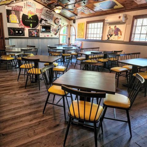
Yellow
Yellow is a cheerful, uplifting color. It’s sunny and warm. However, it can also be overwhelming. It can make people uneasy and more likely to lose their tempers.
When you may want to use it
If you want to turn tables, yellow may be a good option. Like red, it grabs your attention, but discourages lingering.
Consider yellow for fast food, cafes, and yogurt or ice cream shops — places that your guests won’t be spending several hours.
When to avoid it
If you want your guests to feel comfortable and relaxed, yellow is not the color for you. Also, make sure to look at swatches of yellow in all different light levels before committing. What can appear bright and sunny in the morning could have nasty green undertones in the afternoon!
Pink
Light pink can be a calming color, making you think of sensitivity or romance. But a shocking fuchsia or hot pink can act more like red — stimulating and energetic.
When you may want to use it
Most people consider pink a playful color, so it’s great for a fun, laid back restaurant. A bakery or cafe could be a good candidate for pink.
When to avoid it
“Millennial pink” was incredibly trendy in the past few years, with restaurants all over the country dousing themselves in the color. While they are very lovely (and look great on Instagram), the trend is on the way back down. So to avoid looking dated, it may be a better idea to use splashes of pink instead of pink walls, pink tables, pink chairs…
Grey, Beige, or Greige
Grey and beige are solid and dependable. These earthy, natural colors are sophisticated and mature. They’re also incredibly popular in home decor, so guests will feel comfortable with the colors.
When you may want to use them
Grey, beige, and greige make people feel relaxed and unhurried. So they’re good choices if you want people to linger.
They’re also versatile. You can dress them up or down, and change out curtains, furniture, and fixtures without having to change the wall color. Plus, they generally look good in both bright and dim light.
When to avoid them
If you want to churn and burn, pick something flashier. Also, grey can be very cool. Warm it up with wood tones and warm accent colors to prevent it from getting too clinical.
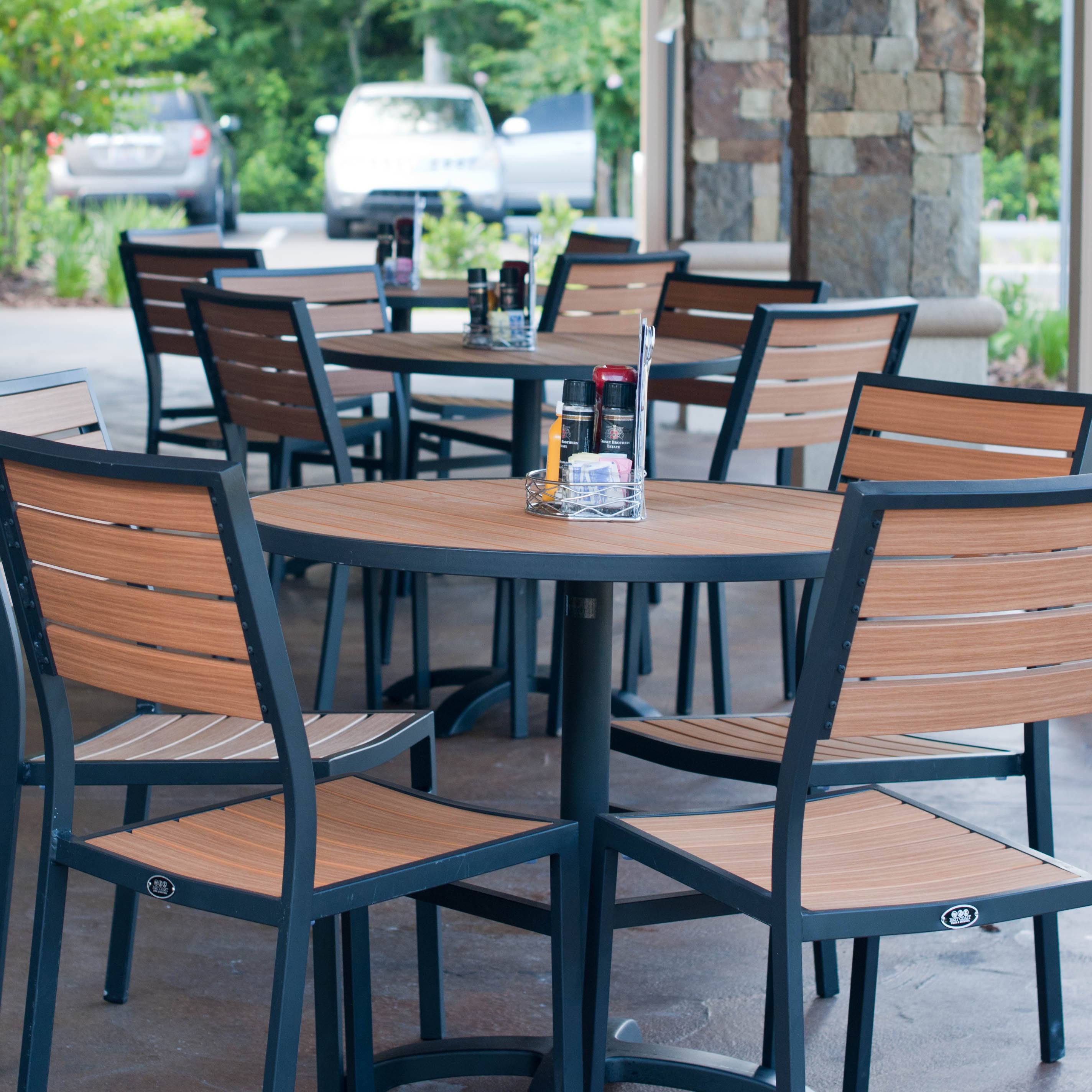
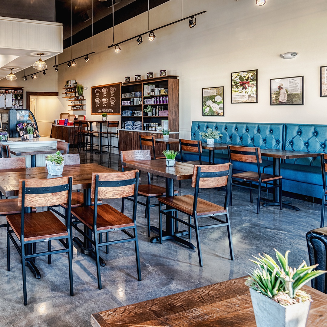
Brown
Brown is the color of wholesome sincerity. It is grounded and safe. brown makes a great earthy backdrop to other vibrant colors like yellow and turquoise.
When you may want to use it
Brown is associated with nature and the outdoors. It can be a great compliment to green.
It’s also a warming color, associated with chocolate, coffee, and baked bread. A coffee shop, deli, or bakery would be cozy in tan or light brown.
When to avoid it
If the rest of the space is very neutral, brown may not be the best choice. Too much of a good thing, in this instance, can become very boring.
White
White represents innocence, peace, and hope. It is often associated with cleanliness, which may be why a lot of health food restaurants are mainly white. Choosing a white can be surprisingly difficult, as many have blue, yellow, pink, or green undertones.
When you may want to use it
If you have a small space, white can make it look larger. It can also help to brighten up a dim room. It’s a simple backdrop color that you can then decorate with pops of color and art, without it looking too busy.
White is also great with texture. For example, white subway tile or penny tile are classic choices, Grey or black grout can add some interest. And white curtains in gauze or a rustic linen can warm up a room.
When to avoid it
If your restaurant is already large, painting it white can make it look cavernous. You may be better off with a darker hue to make your space feel cozier.
Final notes
Clearly, there is no one color that you should always (or never) use.
But a few things to remember — never rely on that tiny little paint chip from the hardware store when making your choice. Always get a sample and paint a big square on the wall. See how it looks at all times of day and night before making a decision.
Also, the pros say it’s easier to start with a textile, like a curtain or a cushion color, before selecting paint colors. That way you’ll have something to coordinate your wall color with, instead of staring at the hundreds of paint color options with no guidance.
And if you really can’t decide — it may be time to call in a professional.